Wellmate: Gamified Workplace Wellness App Design
Mobile gamified wellness app for workplace teams
Work together?
Get in touchCLIENT
Bright Skills
ROLE
UX research & design
DELIVERABLES
User flows, Figma prototype, graphic assets
PLATFORM
OutSystems
TIMELINE
2 weeks (2024)
Brief
"In order to encourage more physical activity & social exchange in a team, a user can create a 'workout of the week' that everyone should complete - five squats before lunch, etc"
Core Challenge
Create a gamified social wellness app that takes into account the different motivations people have for engaging.
Bonus Challenge
This was commissioned as an in-house project at Bright Skills where I interned. It was intended as a proof-of-concept for the junior developers learning the OutSystems low-code platform, so in addition to the application brief I also had some technical requirements:
- Simple design with no animations
- No SVG or other built-in graphics (only PNG)
- Must use AI in some capacity
Outcome
Delivered: Interactive Figma prototype and visual assets to Bright Skills development team.
Implementation: Developed as a non-functional proof-of-concept in OutSystems by junior developers learning the platform. The interface was implemented; challenge generation and social mechanics remained placeholder-only.
Business outcome: Bright Skills added this to their portfolio as a showcase example of rapid mobile app prototyping in OutSystems, demonstrating LLM integration (this was early 2024, early days of LLM adoption).
User outcome: The app was never deployed or used by actual office teams. It exists as a technical demonstration, not a validated product.
Meta-goal achieved: The project successfully demonstrated Bright Skills' ability to quickly iterate on mobile-ready applications and integrate emerging AI capabilities—both key selling points for their consulting services.
Method Selection: Check Out the Competition
I had two weeks to deliver a finished design, with a wireframe delivery halfway through. To get started quickly - and since this app was an exploratory MVP rather than building on an existing hypothesis - I conducted competitive analysis to try to assess the mechanics and value proposition of the most popular gamified games and task-oriented apps.
This approach is full of confirmation bias since gamification often targets people with certain behaviors, not necessarily representative of people in a typical office - which was our target audience.
Still, I was able to identify some useful trends:
- Friendly tone and playful colors
- Sincere and personal challenges
- Minimal shaming of non-participants
Many of the successful approaches were out of reach for us - fancy graphics, sound design, game elements, advanced progression ladders, etc - and we had no incentive to upsell participants on microtransactions or rewards, so I could safely ignore such features.
Since the environment for our app was corporate, I wanted to allow both "positive" and "negative" participation. There's a risk of encouraging "toxic positivity" with initiatives like these which is counterproductive to the goal of encouraging team spirit, and allowing someone to participate on their own terms seemed like an important aspect - for example, you could set difficult or unclear challenges, allowing you to "vent" while still participating in the social aspect of the app.
At the same time, I sketched the requirements for a minimal user flow - my goal was to maximize possible engagement across as few screens as possible so we could develop an MVP faster, as well as force myself to focus on clear IxA and UX copy.
I also dove into academic research. For example, the article "Gamification in Apps and Technologies for Improving Mental Health and Well-Being: Systematic Review" (Cheng VWS et.al) identifies 18 different gamification mechanisms in apps that promote mental well-being. There wasn't enough time to evaluate the results of my app, but this article and others provided good ideas for how to break down participant motivation.
Competitive Analysis: What We Learned
I analyzed 10+ wellness and gamification apps to identify success patterns and anti-patterns. Apps examined included Habitica (gamified habits), Sweatcoin (steps-to-rewards), Noom (calorie tracking with friendly tone), Challenge Accepted (social challenges + leaderboards), Stridekick (group fitness challenges), and Fitness RPG (character leveling through exercise).
Key Insight 1: Onboarding Friction Kills Adoption
Research shows every additional onboarding step loses 20% of users. Apps like Sweatcoin and Habitica succeed because they minimize setup—you're engaged within 2-3 taps. This informed our decision to make challenge rating optional, not mandatory.
Key Insight 2: Choice Paradox
Habitica offers extensive customization (difficulty levels, categories, filters) but requires significant content creation from users. Apps with pre-generated content (like Stridekick's curated challenges) see higher engagement. Our approach: One weekly challenge for the whole team—removes decision paralysis while maintaining social connection.
Key Insight 3: Tone Matters More Than Features
Noom succeeds not because of superior tracking, but because of its encouraging, non-judgmental tone. Apps that shame non-participation (showing "0 days" streaks prominently) have higher churn. Our approach: Allow neutral/negative challenge ratings to give users agency without forcing toxic positivity.
Key Insight 4: Dark Patterns to Avoid
Many wellness apps use manipulative mechanics: spin-the-wheel randomness, pay-to-win tiers (Sweatcoin's 2x earnings), artificial urgency. We deliberately avoided these—our goal was team cohesion, not addiction.
What We Couldn't Implement (OutSystems Constraints):
- Complex progression systems (Fitness RPG's character leveling requires extensive backend)
- Rich animations and micro-interactions
- Advanced gamification (achievements, unlockables, leaderboards over time)
- Wearable integration (Hops' Apple Watch integration)
Our Adaptation: Focus on social mechanics (team-wide challenges) over individual gamification. Prioritize simplicity (one challenge per week) over variety (endless challenge libraries). Enable both "positive" and "critical" participation to avoid workplace wellness becoming performative.
User Flow & Initial Sketches
.jpg)
Sketching, interactive wireframes and flow charts complement each other - where one needs to be rigorous or pedagogical, the other can just throw in a "cool animation icon here" without worrying about the details or effort to do it - it comes out in the discussions with PO and the dev team.
 liggande.jpg)
Gamification & User Flow
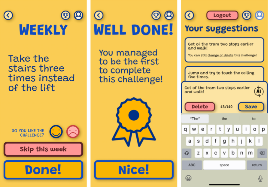
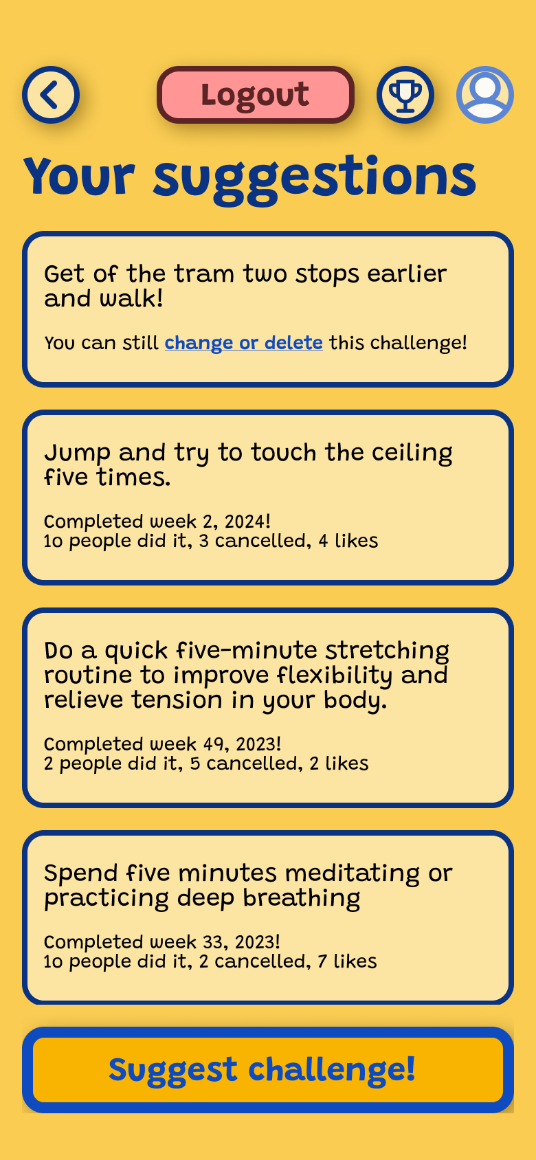
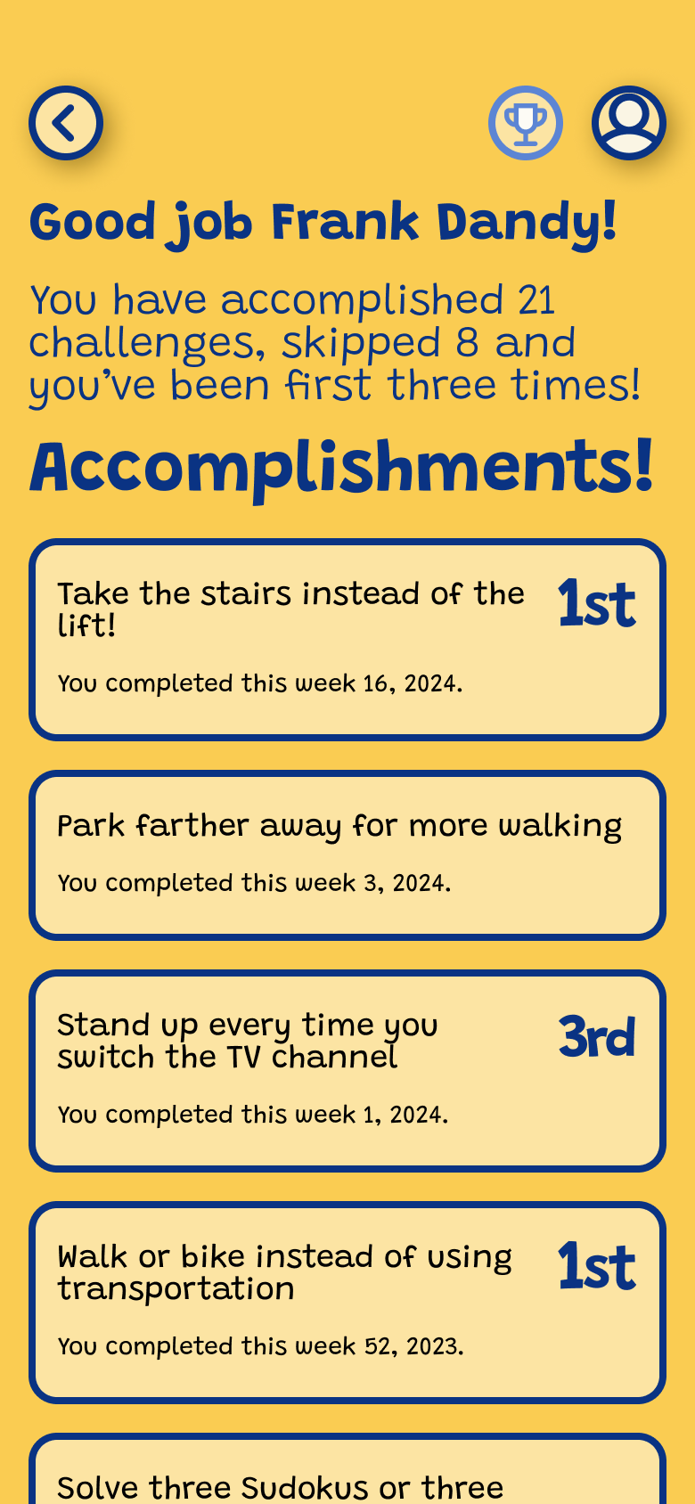
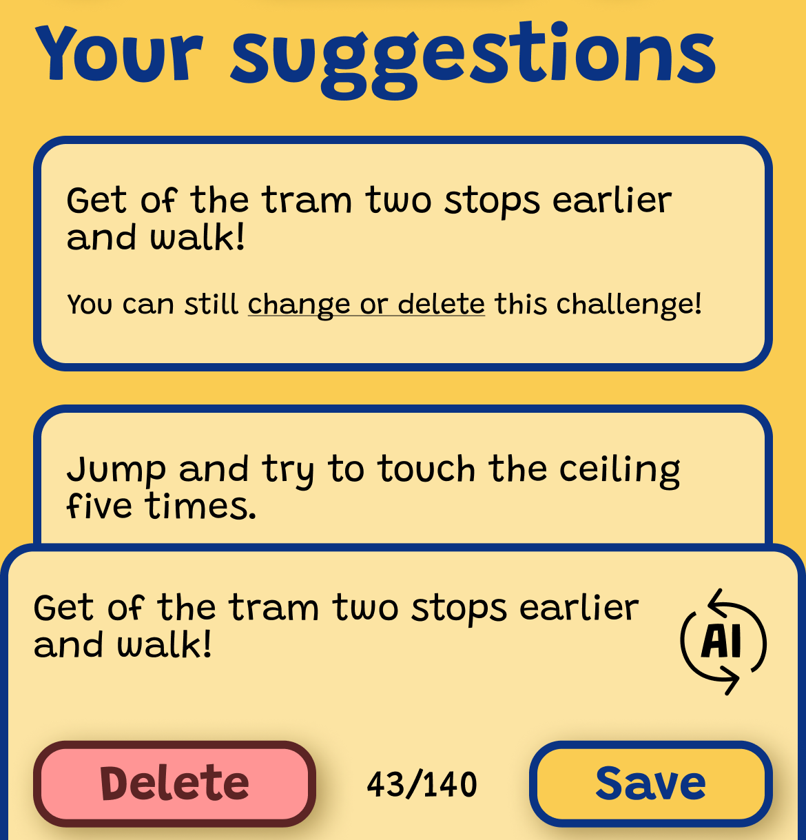
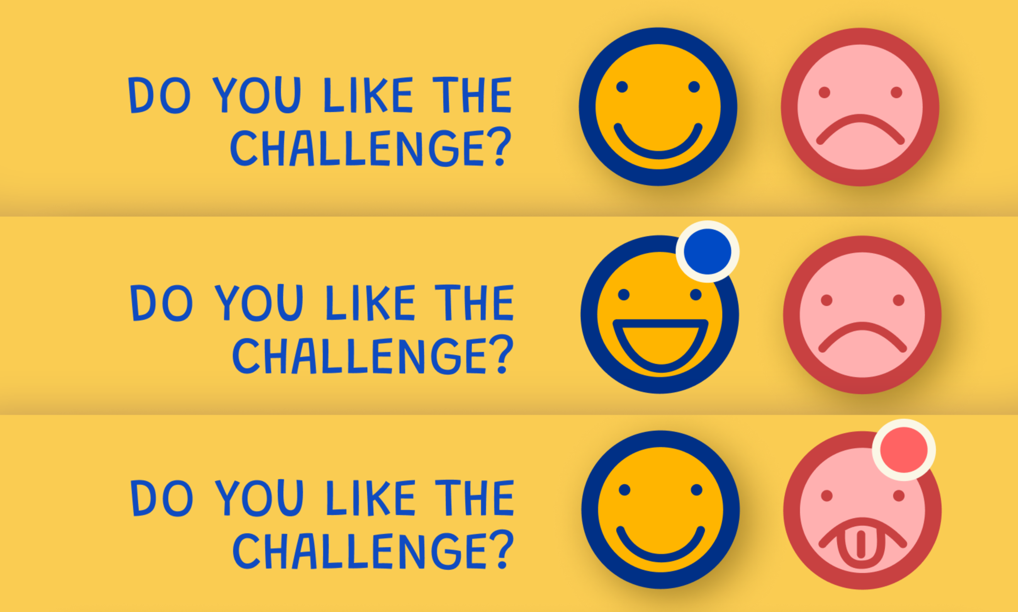
Wellmate presents all users with the same challenge a given week and resets on Monday morning. As a user, I can choose to skip this week's challenge, I can rate it good/neutral/bad, and I can suggest my own challenge to the team which gets added to the pool of challenges, with one challenge randomly selected from the pool per week.
The social and gamified elements in Wellmate are intended to be obvious but not perceived as manipulative: Complete and rate challenges, and suggest your own challenges. The challenges are open enough that they allow different "play styles" as well as both extrinsically and intrinsically motivated participation.
Design Validation: Coffee Shop Testing
While this was a proof-of-concept prototype without functional backend, I conducted informal usability testing of the UI elements (like/dislike buttons, challenge creation, skip challenge, navigation) in coffee shop settings to validate IA and interaction patterns.
Key feedback that shaped final design:
- Increase spacing between interactive buttons (users accidentally tapped wrong option)
- Make active/passive button states more visually distinct
- Clarify that challenge rating is optional, not required
These quick validation sessions ensured the core interactions were comprehensible even without the gamification mechanics fully functioning.
Coffee shop testing isn't rigorous user research, but it's valuable rapid validation when timelines are tight. Getting 5-10 people to tap through a prototype in 10-minute sessions revealed interaction friction I hadn't noticed—especially around button affordances and optional vs required actions.
The most important finding: users assumed rating challenges was mandatory and felt stressed when they couldn't decide. Adding "Skip rating" as an explicit option (rather than implicit) immediately reduced confusion.
AI Interaction and Integration - Still Early Days
Using AI was a requirement in the process, and adding it to the challenge generation function seemed like a good fit. The developers integrated ChatGPT 3.5 and wrote an agent with instructions to generate wellness-focused challenges, character limits, etc.
This proved technically feasible for the most part, but of limited value to the app's core mechanism - quite often the challenges were generic and difficult to complete ("eat healthy breakfasts this week!") which risks lowering participation. Who wants to obey a pollyanna AI just because HR told them to?
Gamification has obvious uses for AI in environments like these, but the agents must be closely tailored and evaluated as a core part of the application, rather than just being slapped on - especially in cases where the goal is "human interaction".
Research on how LLMs affect social interactions has only just begun, but "Artificial intelligence in communication impacts language and social relationships" (Hohenstein et.al) points out that although many are skeptical of AI-mediated social interactions (automatic message handling, for example), this skepticism doesn't transfer when users are more familiar with how the system works, as long as the system is transparent and offers an improvement.
Collaboration Lessons: Design-Dev Communication
The Three-State Button Challenge
The most significant development friction came from a seemingly simple UI pattern: the challenge rating buttons.
The requirement: Two buttons (thumbs up/thumbs down) that could represent three states:
- Neither selected (neutral/no rating)
- Thumbs up selected (positive rating)
- Thumbs down selected (negative rating)
Each button toggles between two visual states, but they also affect each other—selecting one deselects the other.
The problem: My Figma prototype showed the interaction clearly in motion, but developers couldn't decode the state logic from the prototype alone. They couldn't see the "rules" behind the interaction.
The Solution: Multiple Communication Methods
I had to explain the same interaction three different ways before the dev team understood:
- Figma prototype (showed behavior, not logic)
- Hand-drawn button states with arrows showing transitions
- State table listing all possible combinations and resulting states
Lesson learned: Interactive prototypes don't always communicate intent clearly. Complex UI logic needs explicit documentation—state diagrams, truth tables, or written specifications—especially when working with developers unfamiliar with Figma's prototyping features.
What I'd do differently: Define interaction patterns upfront with developers before prototyping. Establish shared terminology for UI states and behaviors. Create a simple "interaction spec" document for anything more complex than standard button/input behavior.
Key Learnings
Constraint-Driven Design
Working within the OutSystems low-code platform's constraints forced creative solutions and prioritization of core features over visual polish.
Design-Dev Communication
Interactive prototypes don't always communicate intent clearly. Complex interactions need explicit documentation with state diagrams and flow descriptions.
AI Integration Challenges
AI should be part of the core design, not an afterthought. Generic AI output risks undermining engagement in social applications.