Blomsterstugorna: Complete Brand Identity for Garden Center
Logo and digital profile for local florist
Work together?
Get in touchTYPE
Brand positioning study
ROLE
Market research & brand design
DELIVERABLES
Brand identity, positioning strategy, demographic analysis
TOOLS
Market research, competitive analysis, Figma
Brief
Create a new logo and digital profile for a local business, including analysis of competition, market positioning and tone-of-voice.
"The cemetery work keeps us stable, but it's never particularly joyful [...] I'm happy to provide comfort during the sad times. It's just not what I love most about flowers."
A completely made-up quote from the imaginary client
Market Research & Positioning
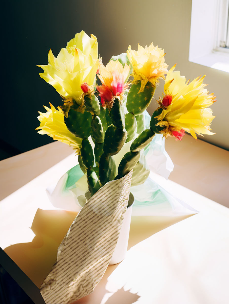
This self-initiated project explores brand positioning for a local florist competing with other florists clustered around the cemetery perimeter.
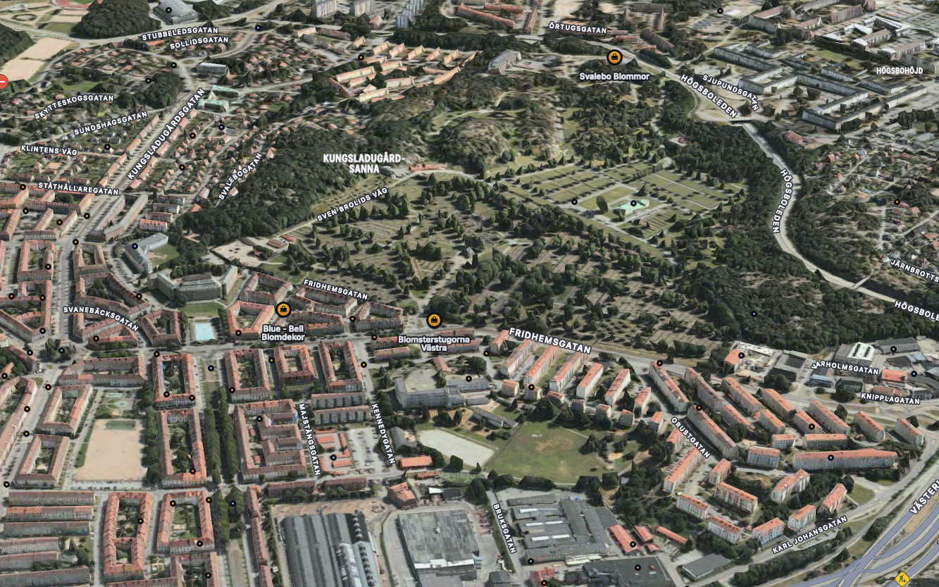
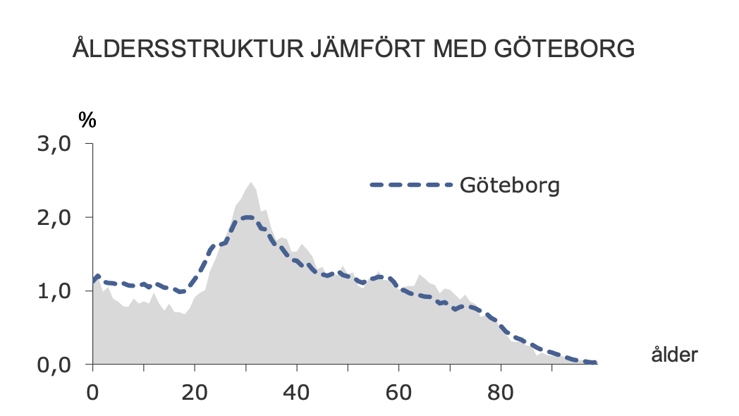
Research approach: Demographic analysis of the Majorna neighborhood in Gothenburg revealed a population skewing towards people in their 30s, with growing interest in sustainable, local businesses rather than traditional cemetery flower services.
Strategic insight: Rather than compete directly with cemetery flowers, position as a neighborhood lifestyle brand emphasizing everyday moments, sustainability, and local community.
While this is a conceptual exercise (not a real client), it demonstrates product thinking: understanding market context, identifying positioning gaps, and designing brand identity to address specific competitive challenges.
Location, location, location
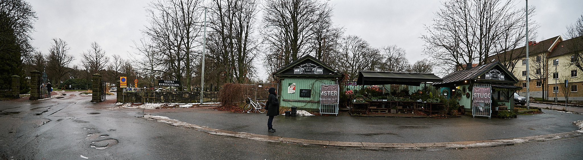

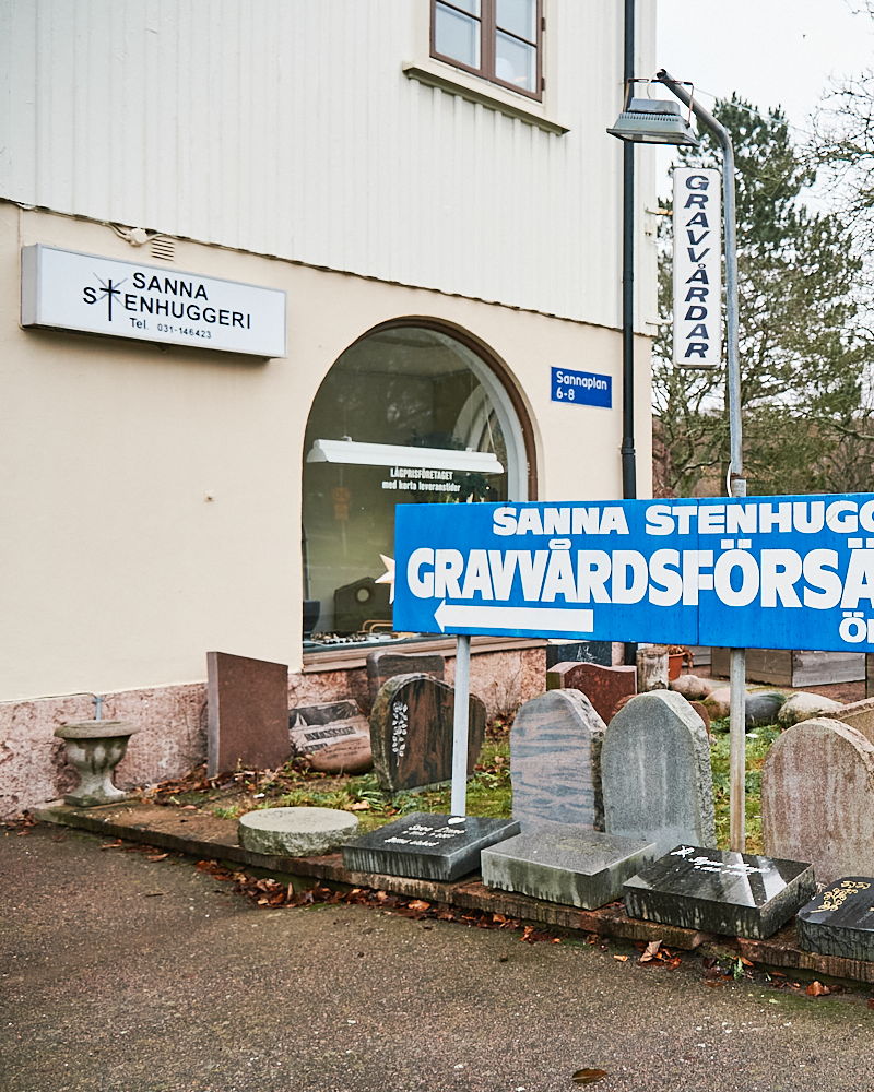
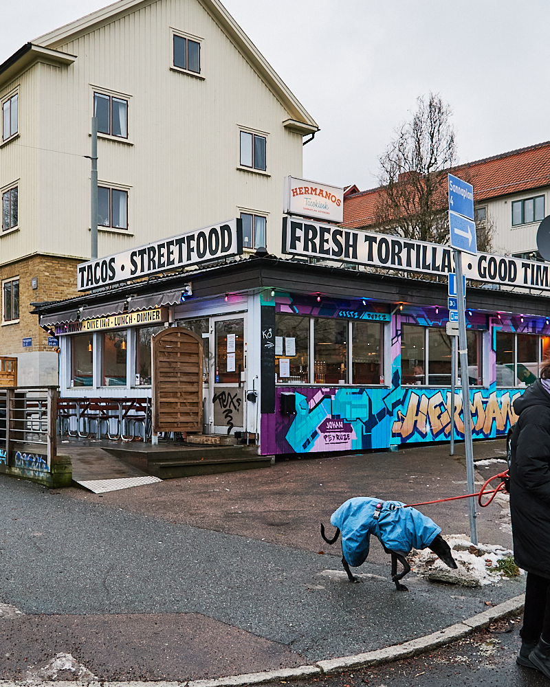
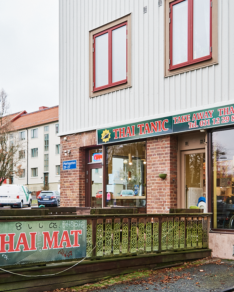
The florist is located in western Gothenburg on the border between Majorna and Sandarna. Due to the city's expansion and gentrification process, the area has seen an influx of affluent families while retaining the typical appearance of the three-story-high Landshövding houses that are characteristic of the area.
To maintain Blomsterstugorna's local feel, I mapped the color schemes and general appearance of the surrounding streets and tried to get a sense of the level of "professionalism" that local businesses maintained.
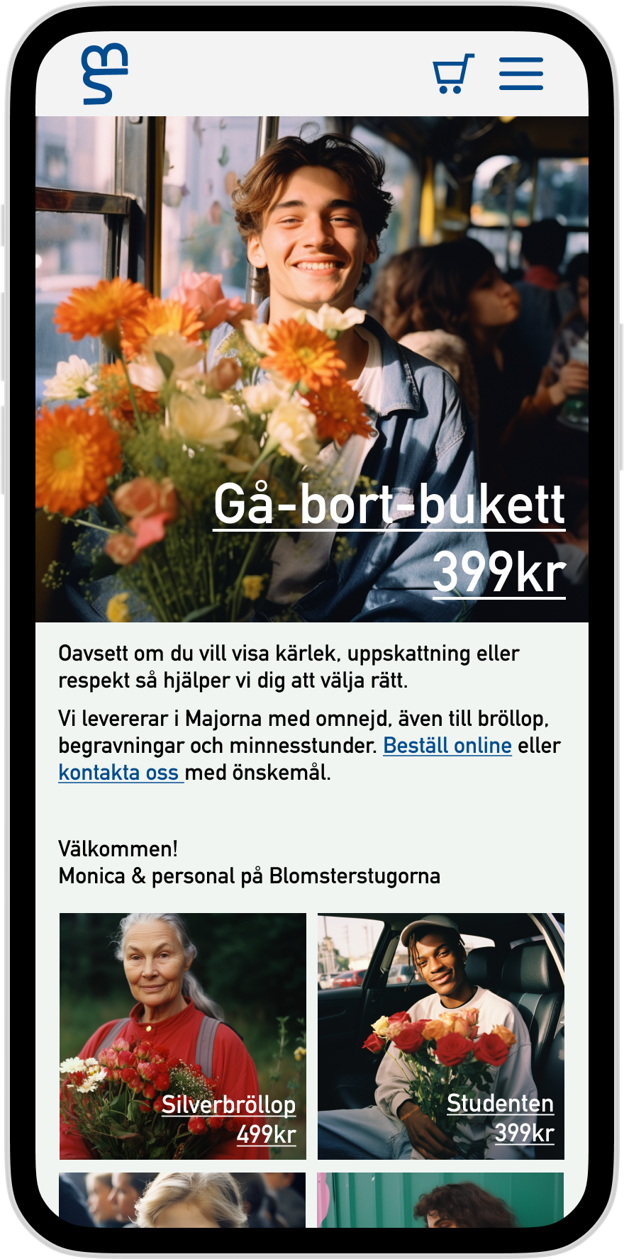
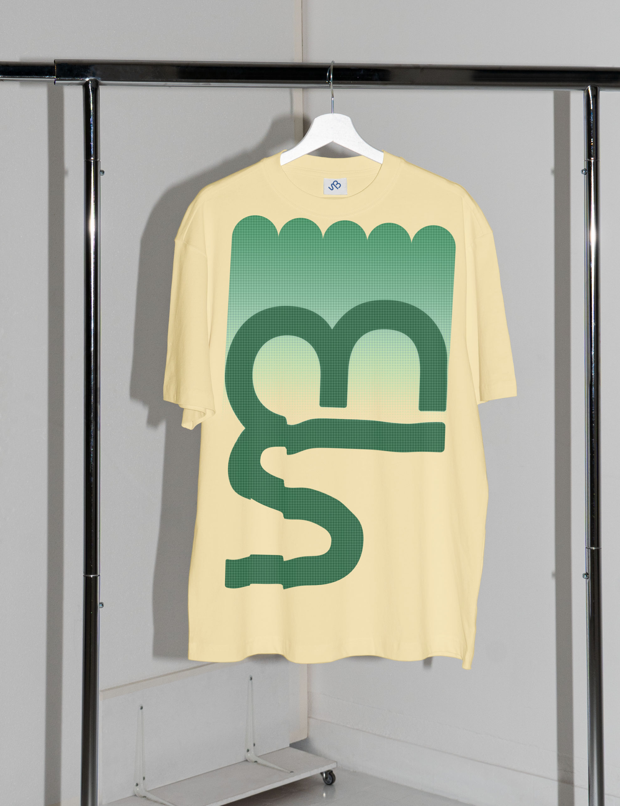
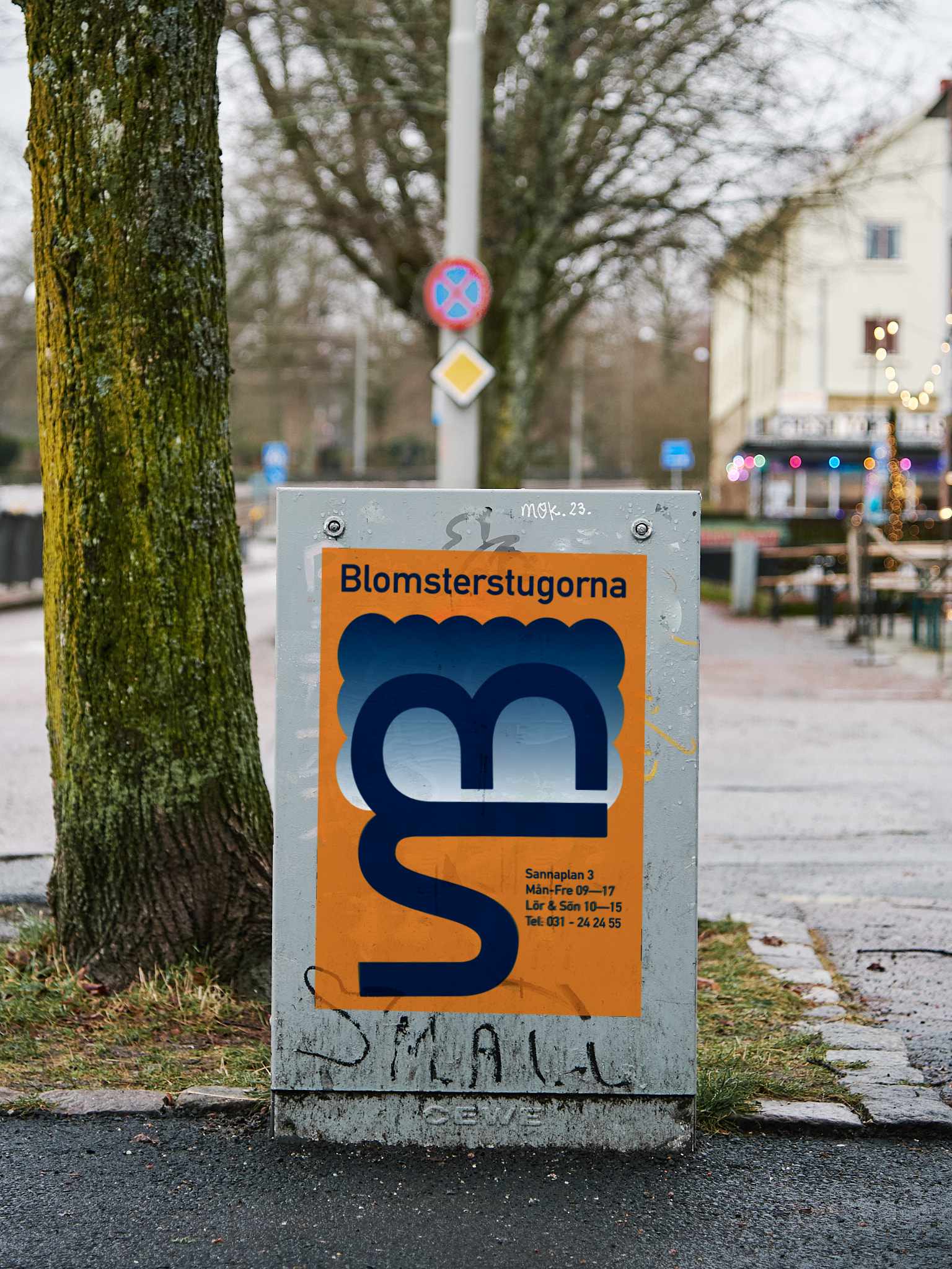
Logo
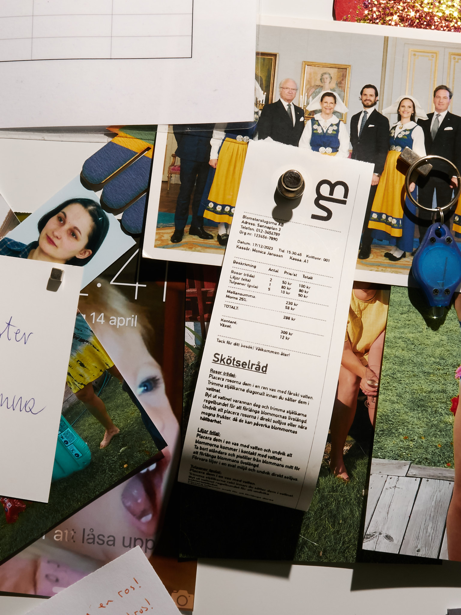
The monogram is based on ITC Bauhaus and softened into an organic form intended to mimic the stem and petals of a flower. The typeface for other text is DIN 1451, which enables a consistent and contemporary appearance on websites, flyers, etc.
Design versatility: The logo was intentionally designed to be drawable by hand while retaining brand identity—allowing staff to sketch it on chalkboards, wrapping paper, and signage without losing recognizability.
Creating digital and physical mockups helps sell the idea of what's possible, and I'm particularly pleased with how versatile the logo is—from digital screens to hand-drawn chalk signs.

AI video
I used an AI video filter to generate a couple of moving mockups of a sign for the shop. In a very short time, I was able to convey an environment and feeling better than any still image could.
Website & Instagram
Most customer engagement takes place on Instagram, where we have plenty of opportunities to shape this narrative without appearing fake.
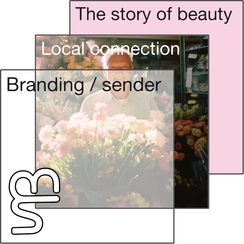
Layered branding approach: This tiered structure was inspired by Causal Layered Analysis (Sohail Inayatullah)—using multiple layers to understand and communicate brand drivers. Rather than a flat message, the brand operates at different depths: surface aesthetics, social patterns, underlying worldviews, and core values.