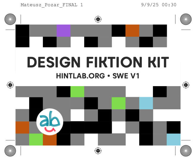
Design Fiction Kit: Swedish Translation of Workshop Tool
Localisation of deck for creating scenarios
Work together?
Get in touchCLIENT
Self-initiated (based on Julian Bleecker's Work kit for Design Fiction)
ROLE
Design & Localization
APPROACH
Iterative card design with workshop validation
DELIVERABLES
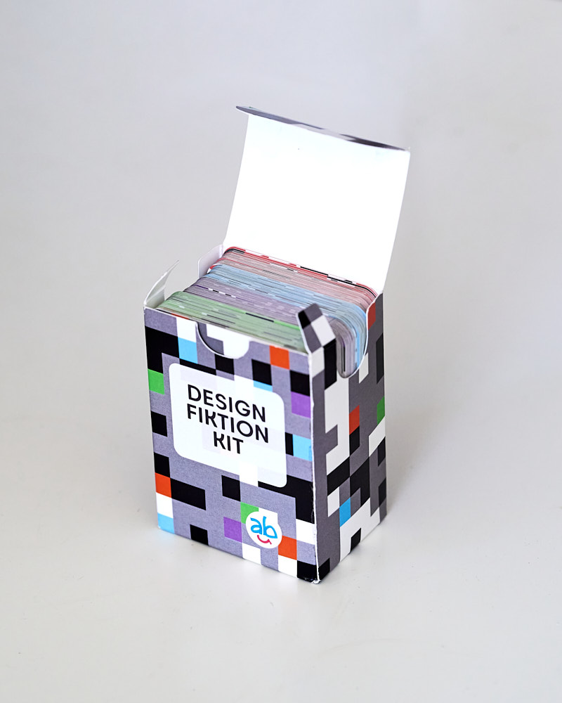
Deck of cards with packaging, printed workshop materials, interactive version
TOOLS
Affinity Suite, lasercutter, Risograph, pen & paper
PLATFORM
Physical, web
STATUS
Launched 2025
Brief
In Winter 2024, I received permission from Julian Bleecker at Near Future Laboratory to localize his Work Kit of Design Fiction for a Swedish context. The goal was to create a culturally adapted version that maintained the methodological rigor of speculative design while resonating more with Swedish references and norms.
Design Challenge
Cultural localization extends beyond translation—it requires understanding how archetypes, objects, and scenarios function within specific contexts. Which of the 102 original cards would work in Sweden? Which needed replacement? How should the visual language balance prescriptive guidance with open-ended interpretation? These questions could only be answered through iterative design testing.
Approach
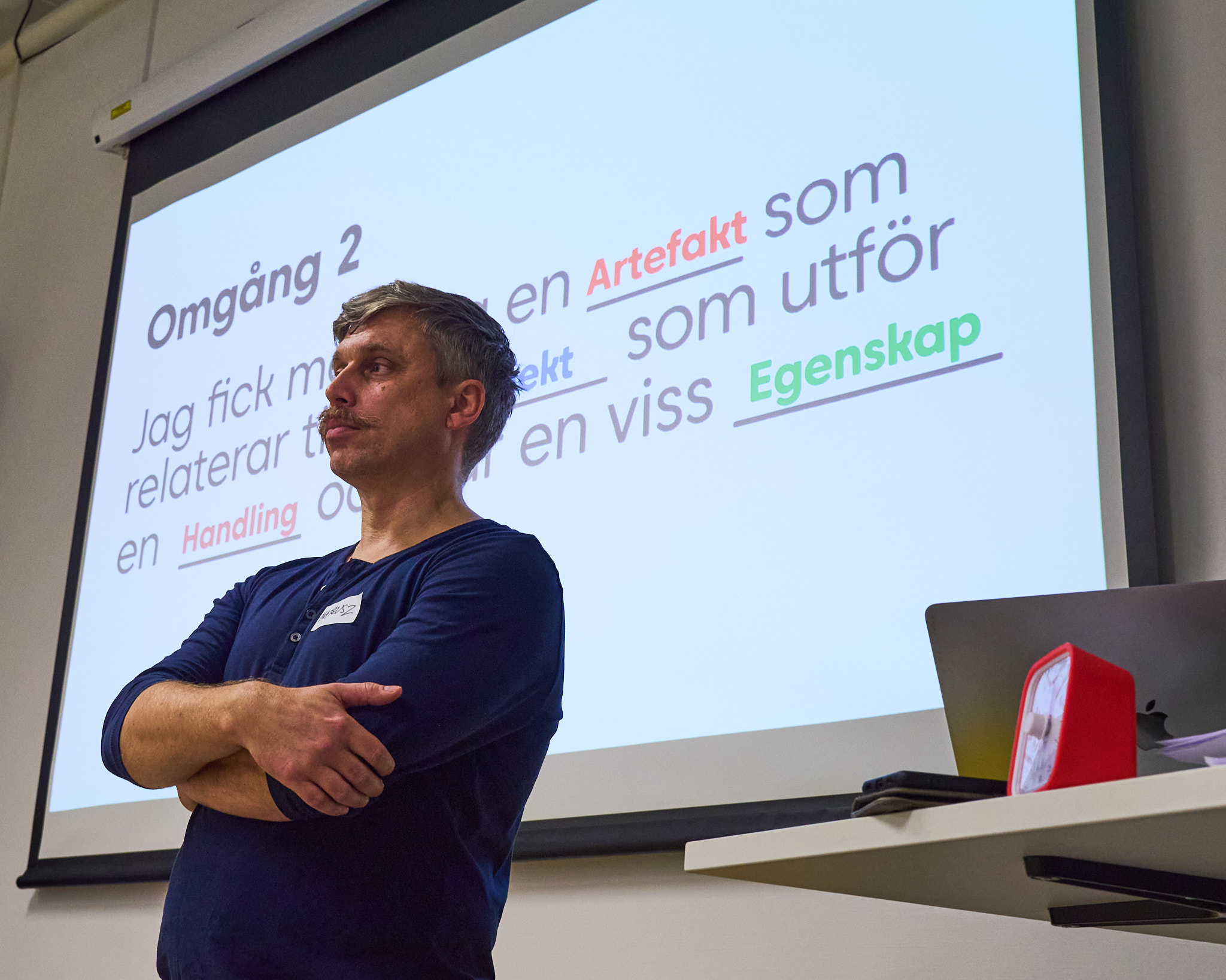
Through participatory design methods, I conducted card sorting sessions, multiple workshop iterations (both in-person and online), and user testing with diverse participants. Each version—from laser-printed prototypes to professionally printed cards—informed decisions about content selection, visual design, and facilitation materials. The research balanced theoretical foundations in futures studies with practical feedback from workshop participants.
Outcome
Launched in 2025 as the first Swedish design fiction card deck, and has been used in several workshops with good results.
Market positioning: No other popular scenario generation decks exist for the Swedish market. While sales have been limited, the deck has proven valuable as a consulting tool under the Matepo.se and hintlab.org brands.
Available at shop.hintlab.org.
Translation as Research
Challenge: Design fiction cards rely on cultural references and shared understanding. Direct translation risks creating disconnected or tone-deaf content that fails to resonate with Swedish workshop participants.
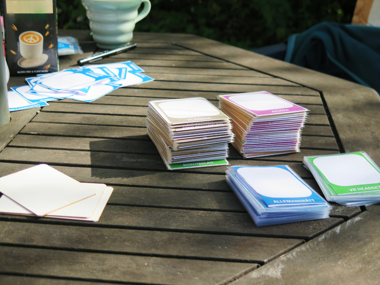
Method: Together with creative partner Sara Henriksson, I conducted systematic card sorting and clustering sessions. Each of the 102 original cards was evaluated for cultural fit—does this archetype exist in Swedish context? Does this object carry the same associations? We created a comparison analysis documenting which cards worked, which needed modification, and which required replacement with Nordic alternatives.
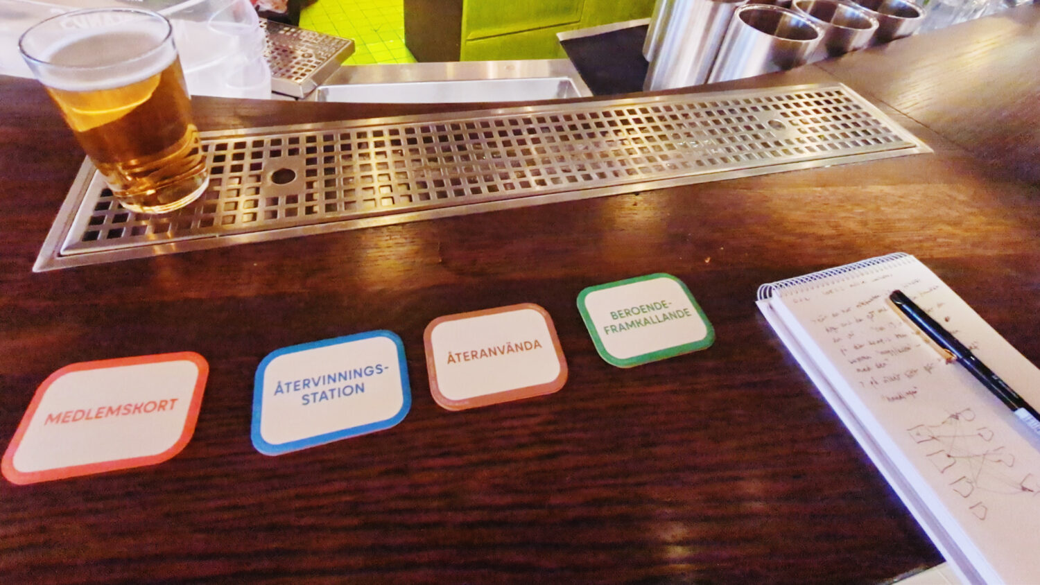
Outcome: A refined deck of 100 content cards (25 per category: Arketyp, Objekt, Handling, Egenskap) plus 5 instructional cards. The selection balanced fidelity to Bleecker's original methodology with cultural specificity. Some cards translated directly; others were reimagined to reflect Swedish social structures, technological contexts, and future imaginaries.
"Translation isn't just linguistic—it's cultural negotiation. Each card needed to function as a generative prompt within Swedish workshops, which meant understanding how different archetypes, objects, and actions would be interpreted by Nordic participants."
The card sorting process involved physical manipulation of printed cards, testing combinations, and imagining scenarios. This hands-on approach revealed dependencies between cards and highlighted which combinations felt natural versus forced in a Swedish cultural context.
Iterative Testing: From Prototype to Practice
Version 1: Early Prototyping
The first physical iteration used laser-printed colored cards in acrylic sleeves with cardboard backing. This DIY approach allowed rapid iteration where we could cross out and change words and card categories directly on the cards.
Version 3: Material Experiments
Shifting to thick cardstock intended for beer coasters, I could inkjet-print and then laser-cut cards for a more tactile, durable prototype. This version underwent testing in two distinct contexts: informal sessions and a structured workshop at RISE.
Insights from User Testing
Context Matters: Pub testing revealed that Design Fiktion Kit works in casual social settings—participants generated playful yet plausible scenarios over drinks. The RISE workshop with more formal participants yielded methodical, structured use of the cards.
Illustration Debate: A critical finding emerged: some participants' attention fixated on illustrations in Bleecker's original deck, becoming unable to move beyond literal interpretations. This led to the decision to create text-based cards, prioritizing imaginative freedom over visual guidance.
Readability: Placing keywords twice on each card improved usability when cards were laid on tables—all participants around a table could read them without needing to rotate or pick up cards.
Making-of: Version 3
Documentation of the production process became part of the research methodology—it helped me understand how material constraints, production techniques, and quality trade-offs informed subsequent design decisions. The hands-on production experience and documentation of all steps ultimately led to the decision to partner with a professional print shop for the final version.
While DIY methods suited prototyping, they couldn't reliably produce the 105 identical cards needed for commercial distribution.
Visual Design as Metaphor
Design Challenge: How should the design communicate the methodology without being distracting, overly obvious, or obscure? The backs needed to serve multiple functions: aesthetic coherence, categorization, and subtle metaphorical connection to futures thinking.
Version 4: Early experiments simplified existing futures/foresight symbols (futures cone, futures wheel, three horizons) into a decorative pattern.
Version 5: Futures cone with uncertain paths to scenario endpoints. Less abstract, but still potentially distracting and prescriptive. Would non-experts see it as decoration or try to decode some meaning?
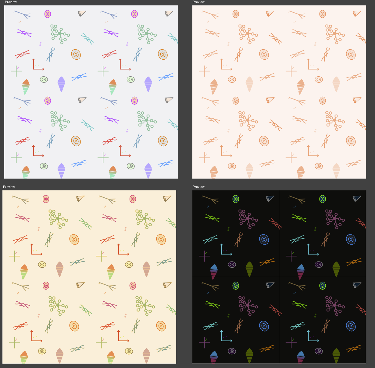
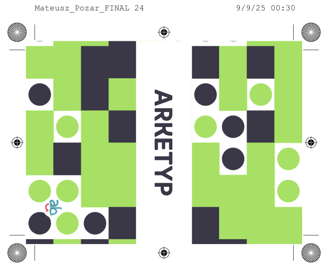
Version 6: Each card has a unique back, showing how small variations in starting conditions yield different combinations—an abstract yet less distracting metaphor for how one can build scenarios. Different colors per category help quick sorting when cards are face down.
Design Solution
The final design balances several requirements: each of the 105 cards has a unique back pattern, the four content categories use distinct colors for quick identification, and instruction cards share the box pattern. This solution followed from understanding that the cards should be as frictionless as possible to use—the design shouldn't compete for attention or impose interpretive frames.
Similarly, the decision to use text-based cards (no illustrations) came directly from workshop observations. When participants saw the original illustrated cards depicting specific machines or scenarios, some couldn't think beyond the literal interpretations they gave rise to. Text-based cards proved more generative, allowing participants to project their own associations onto neutral keywords.
From Craft to Scale
Challenge: How to maintain design integrity while producing 105 identical cards at a quality suitable for commercial distribution? I initially tested craft production methods (Risograph, letterpress, professional inkjet) because they aligned with the project's experimental spirit and DIY aesthetic.
Method: Testing revealed that craft methods, while suitable for prototypes, introduced too much variation and labor when scaled up. Risograph printing, despite its appealing aesthetic, couldn't guarantee consistent quality across batches, and the manual processes risked issues that would undermine the product's credibility.
Outcome: Partnership with a professional print shop that could handle both the complex card layout (105 unique backs) and custom packaging. This decision wasn't merely pragmatic but reflected understanding that tools need reliability. Workshop facilitators need confidence that their cards remain intact and legible, not handmade with charming inconsistencies.
"There's romance in making everything by hand, but the research showed that craft would become a hindrance. The cards needed to be tools, not art objects. Participants should focus on generating scenarios, not admiring printing techniques."
The production decision also weighed sustainability and access—a print shop could fulfill larger volumes and quickly print and modify the design as needed. Scaling required releasing some manufacturing control for greater impact and distribution.
Design Evolution: What We Learned
Each iteration represented a hypothesis about what would make the deck more usable, visually comprehensible, or methodologically rigorous:
V1-V2: Early versions copied Bleecker's structure directly but failed to adapt for Swedish users. Workshop participants were asked to "translate back to American English" in their heads, which increased cognitive load.
V3: Introduction of Swedish-language keywords showed immediate improvement in user testing, but also revealed semantic shifts—some English terms lack direct Swedish equivalents, requiring interpretive choices.
V4-V5: Focus shifted to visual language. How much symbolism was too much? Attempts to incorporate the futures cone and similar foresight frameworks became too prescriptive—we wanted the cards to be methodologically agnostic.
V6 (Final): Text-first design with subtle visual categorization. Each card unique but not distracting. This came from the insight that the method exists in use, not in the cards themselves—the cards are triggers, not instructions.
"The best design decisions were about removing things. Each iteration removed layers: First illustration, then excessive symbolism, then overly methodological language. What remained were artifacts that invited interpretation rather than prescribing it."
Workshop validation confirmed this direction. Participants could spend less time "understanding the cards" and more time generating scenarios.
Design Decisions: Alternatives Considered
Why cards instead of an app?
Digital tools offer scalability and near-costless distribution, but physical cards provide tactile engagement and cause no technical barriers or limitations during workshops. Participants can shuffle, stack, and arrange cards spatially—a thinking with hands that screens cannot replicate. The opportunity cost of digital distribution was weighed against the methodological advantage of physical manipulation.
Why 105 cards?
Bleecker's original set used 97 cards, with different numbers per category. When we reviewed the categories at the start of the process, we considered changing the number, but quickly realized that 75 cards felt limiting for workshops, while 150 cards became overwhelming and risked creating redundant concepts unnecessarily. 100 category cards balanced combinatorial diversity with practical manageability.
Why four categories (not five or three)?
Bleecker's framework uses four card categories (Archetype, Object, Action, Attribute), and since my goal was to make an adaptation of the original version for Swedish conditions, rather than changing the methodology, I decided to stick with the same structure.
"Design decisions must be defended not just aesthetically or culturally, but methodologically. Why this category structure? Why this number of cards? Why physical instead of digital? Good design research requires showing what motivates design decisions."
Complete System: Cards & Pedagogy
The Deck
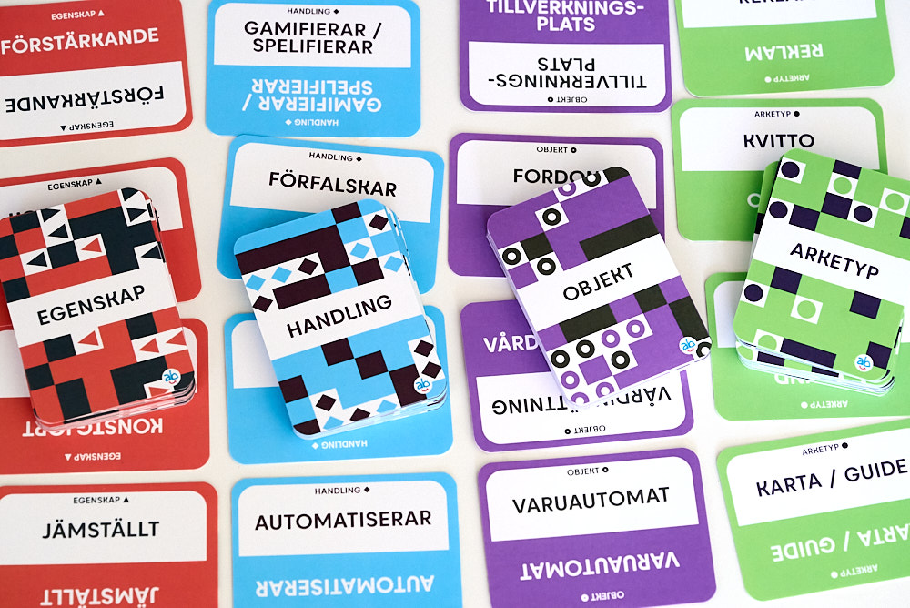
105 professionally printed cards comprise the final Design Fiktion Kit:
- 5 Instruction Cards: Explain methodology, provide workshop structure, guide facilitation
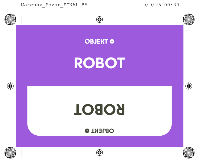
- 25 Arketyp (Archetype): Recognizable objects from today
- 25 Objekt (Object): Concrete artifacts and technologies
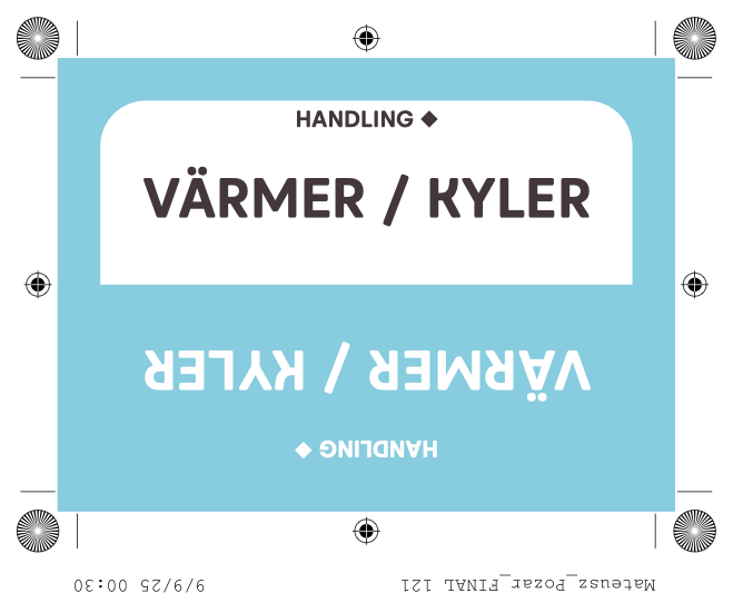
- 25 Handling (Action): Behaviors, activities, and processes
- 25 Egenskap (Attribute): Qualities, states, and characteristics
Each card has keywords printed in both directions for table readability, unique back patterns, and category-specific colors for quick sorting. The box uses the same pattern system, creating visual coherence.
Workshop Materials
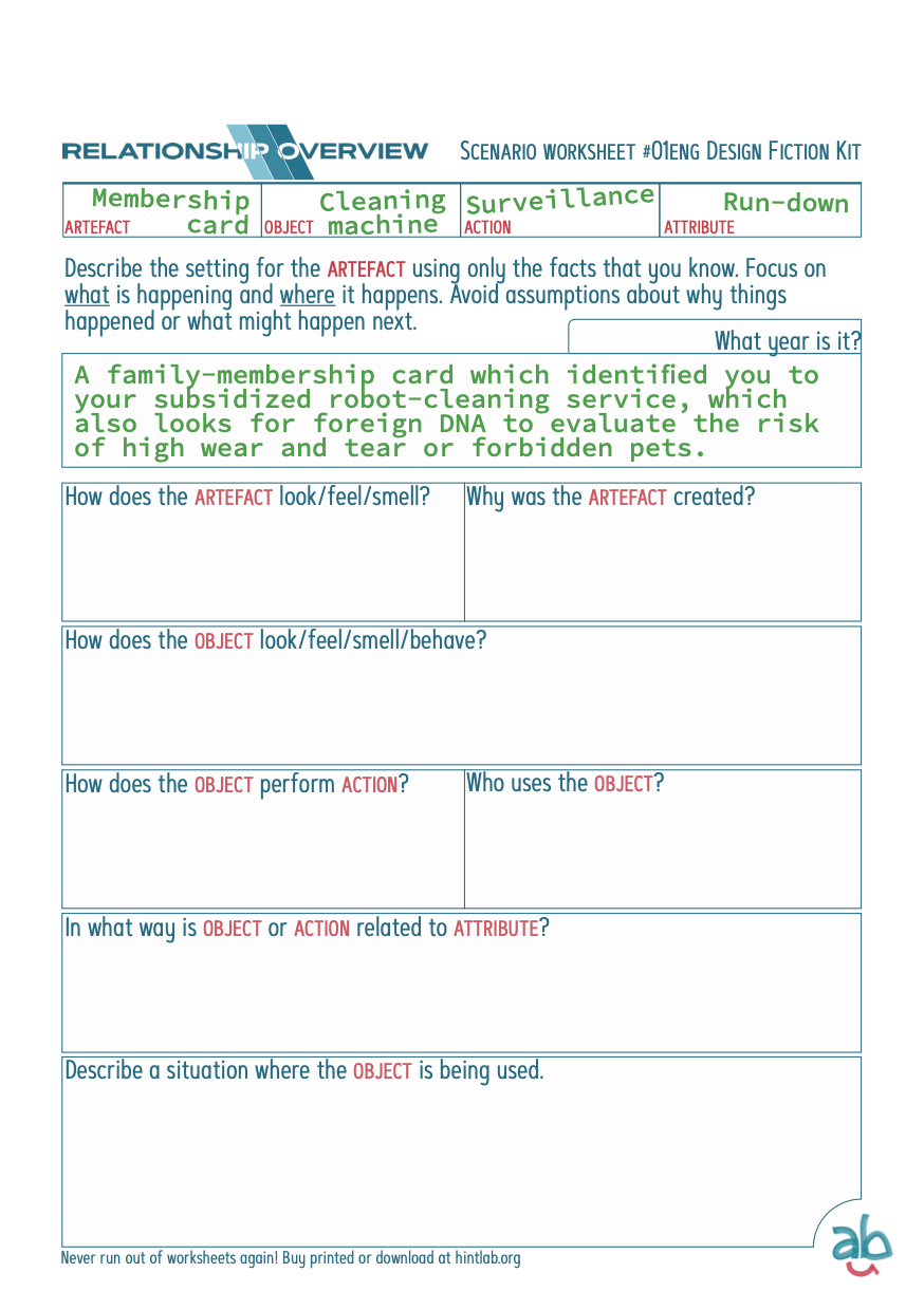
It's entirely possible to run workshops with only the deck, but they can be supported by pedagogical working materials. I therefore created bilingual worksheets (Swedish and English) that offer three methodological approaches:
1. Material Relations: Develop concrete artifacts through detailed scenario description
2. Timeline Building: Map how your scenario becomes real over time using the STEEP framework (Society, Technology, Economics, Environment, Policy)
3. Storyboarding: Visual sequencing emphasizing action and narrative clarity—what does it look like when the archetype or object is used?
They balance prescriptive structure with open exploration, and users can either use them or ignore parts as needed. This flexibility reflects the insight from research that different workshop contexts require different levels of guidance. Worksheets are available as PDF downloads and as Riso-printed and glued tear-pads.
"The worksheets acknowledge that prescriptive versus free isn't binary but a spectrum. Good facilitation tools offer structure without constraint, guidance without prescription."