Closebuy: WCAG-Compliant Map Icons for Hyperlocal Shopping
WCAG-compliant map icons for hyperlocal shopping
Work together?
Get in touchCONTEXT
Academic project
ROLE
Icon design & accessibility
DELIVERABLES
Icon set with WCAG 2.1 AA compliance
TOOLS
Figma, Color Oracle, contrast checkers
Brief
Create map pictograms and SVG icons that pass WCAG contrast control as well as common color blindness checks.
Core Problem
Map icons must be visible on many different backgrounds, compete with other map markers and icons, and simultaneously constitute a sufficiently flexible design system that can be expanded with more categories as needed. Tricky work and compromises in abundance!
Result
A streamlined IxA enabled me to cut down the icon categories to six, which I could then solve using both pictograms and colors, as well as provide styling for the map.
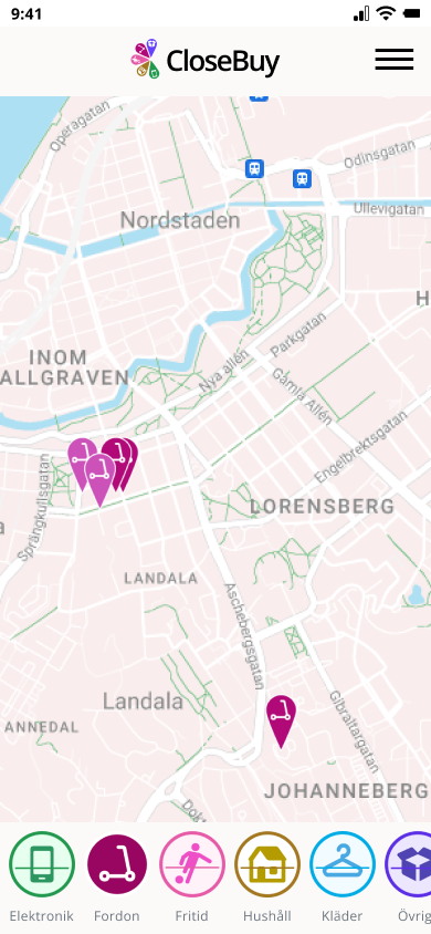
App Design & Icon Method
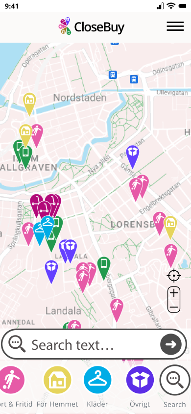
The web app provides hyperlocal secondhand shopping, and the design goal was to create an intuitive view of items for sale in your immediate area.
My method for ensuring WCAG compliance:
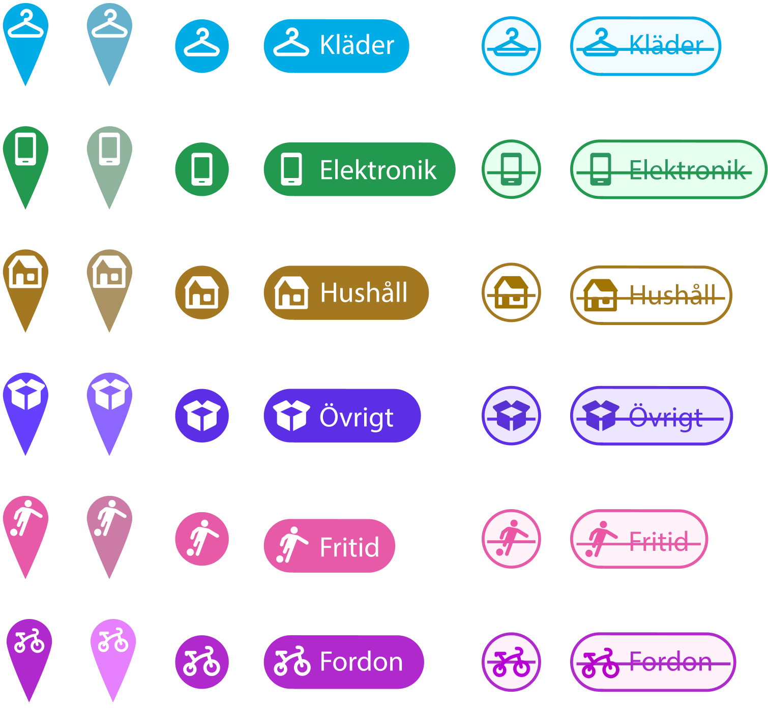
1) Keep the number of necessary icon categories to a minimum.
2) Use a map API that allows me to remove unnecessary layers on the map as well as the ability to style colors and line weights.
3) Use standard pictograms where available, and ensure that colors are distinguishable. Test and test again.
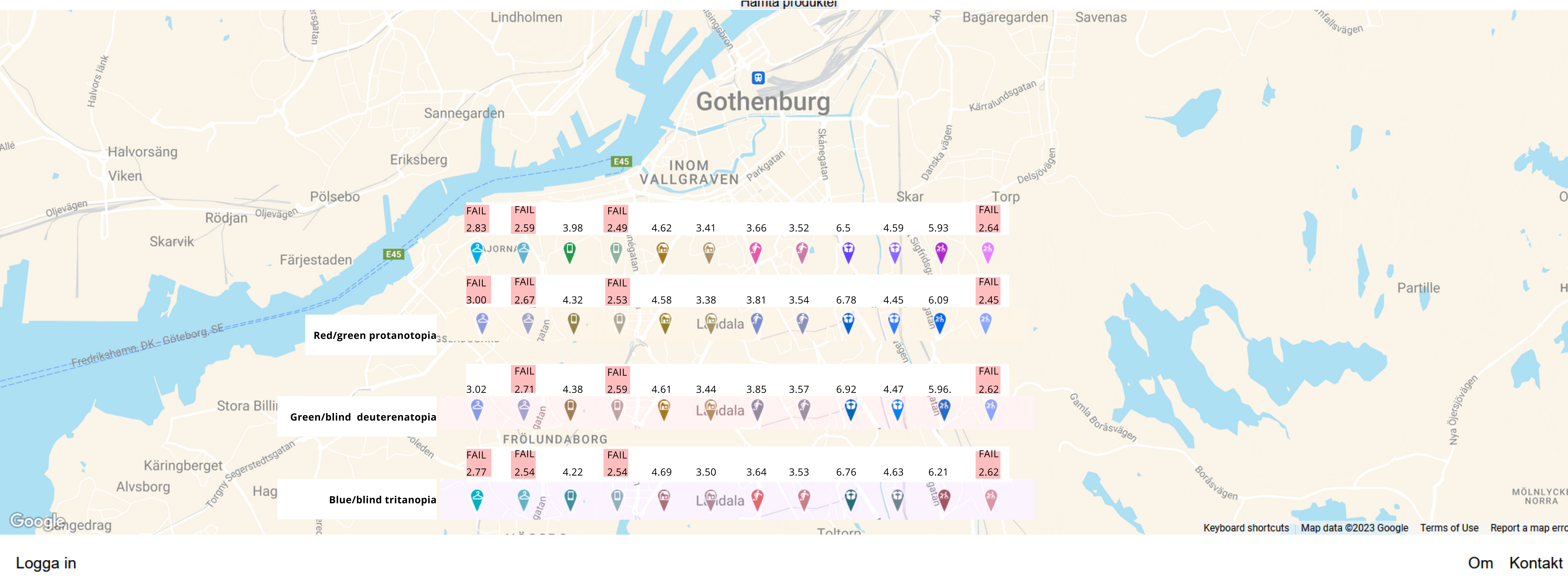
Accessibility Validation
WCAG 2.1 Level AA Compliance
- Criterion 1.4.3 (Contrast Minimum): Achieved 4.5:1 contrast ratio for all icons against map background
- Color blindness testing: Validated with Color Oracle simulator for deuteranopia, protanopia, and tritanopia
- Icon sizing: Minimum 42×42px to meet touch target requirements
Scope Limitation
This project focused exclusively on visual icon design and color contrast. Screen reader compatibility and assistive technology testing were outside project scope.
The icons meet visual accessibility standards, but a production implementation would require additional work on semantic HTML, ARIA labels, and other assistive technologies.
Testing for Visibility. Over and Over Again.
We decided on six shopping categories and I set about looking at existing pictogram systems. I decided to use Material Design icons where possible.
At the same time, I tried different combinations of icon and map colors. This required a lot of back and forth since it's a dynamic relationship.
In the end, I had created a color scheme that enabled me to have two states per button, with reasonable visibility for the most common color vision deficiencies.